Wednesday, March 26, 2014

...A Couple More... For Now

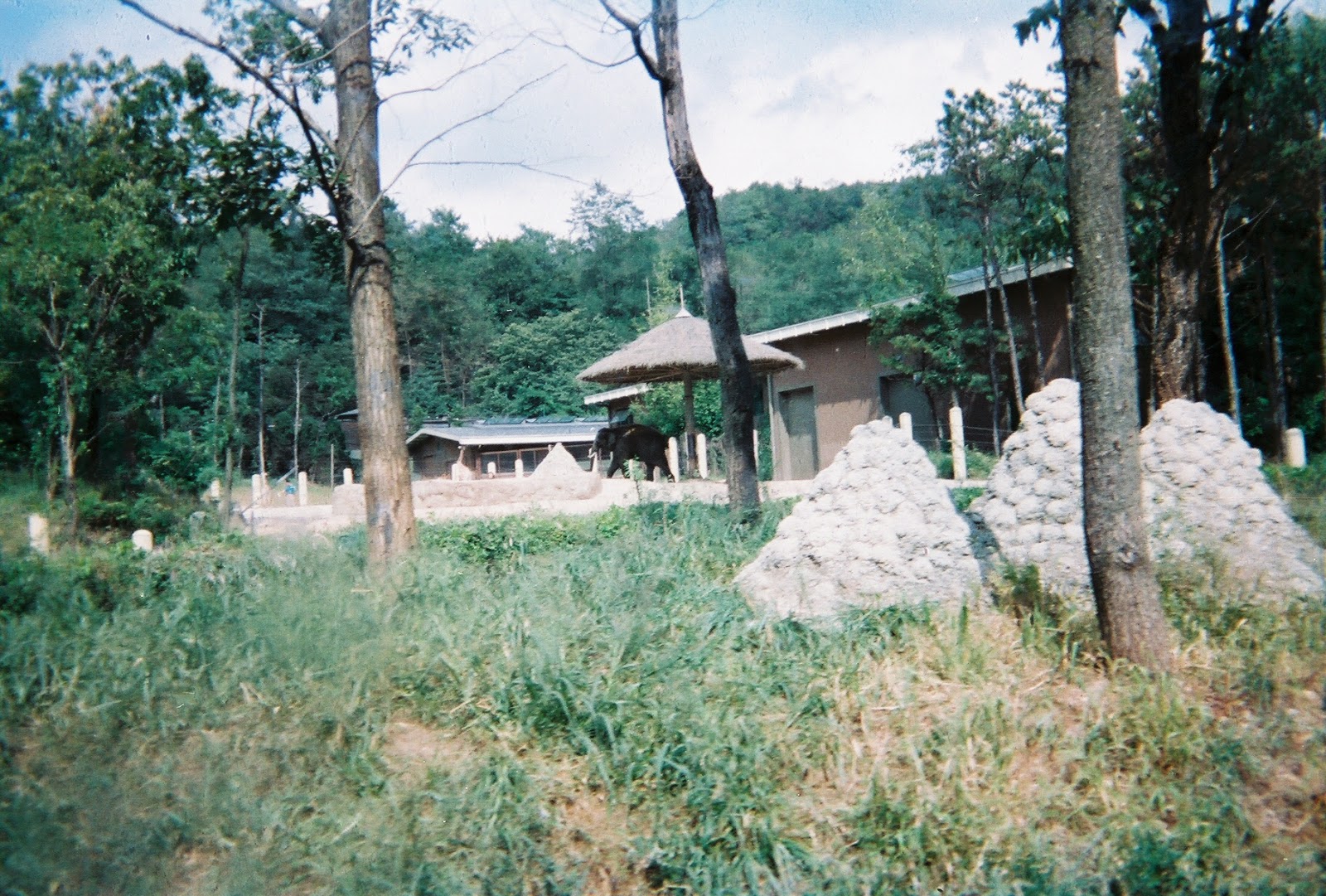
 Here are two more photos for now until I finish working on the others.


 This was taken behind Cordage Park in Plymouth, MA in an area designated as a safe place for the public to roam and walk around. I used Camera Raw (shot in RAW format) to add texture and contrast to this group of otherwise dull concrete blocks. I wanted to accentuate the wear and tear as well as give texture and contrast to the differences in color and depth of each block. I edited this with the intent of re-creating what it looked like in my memory.

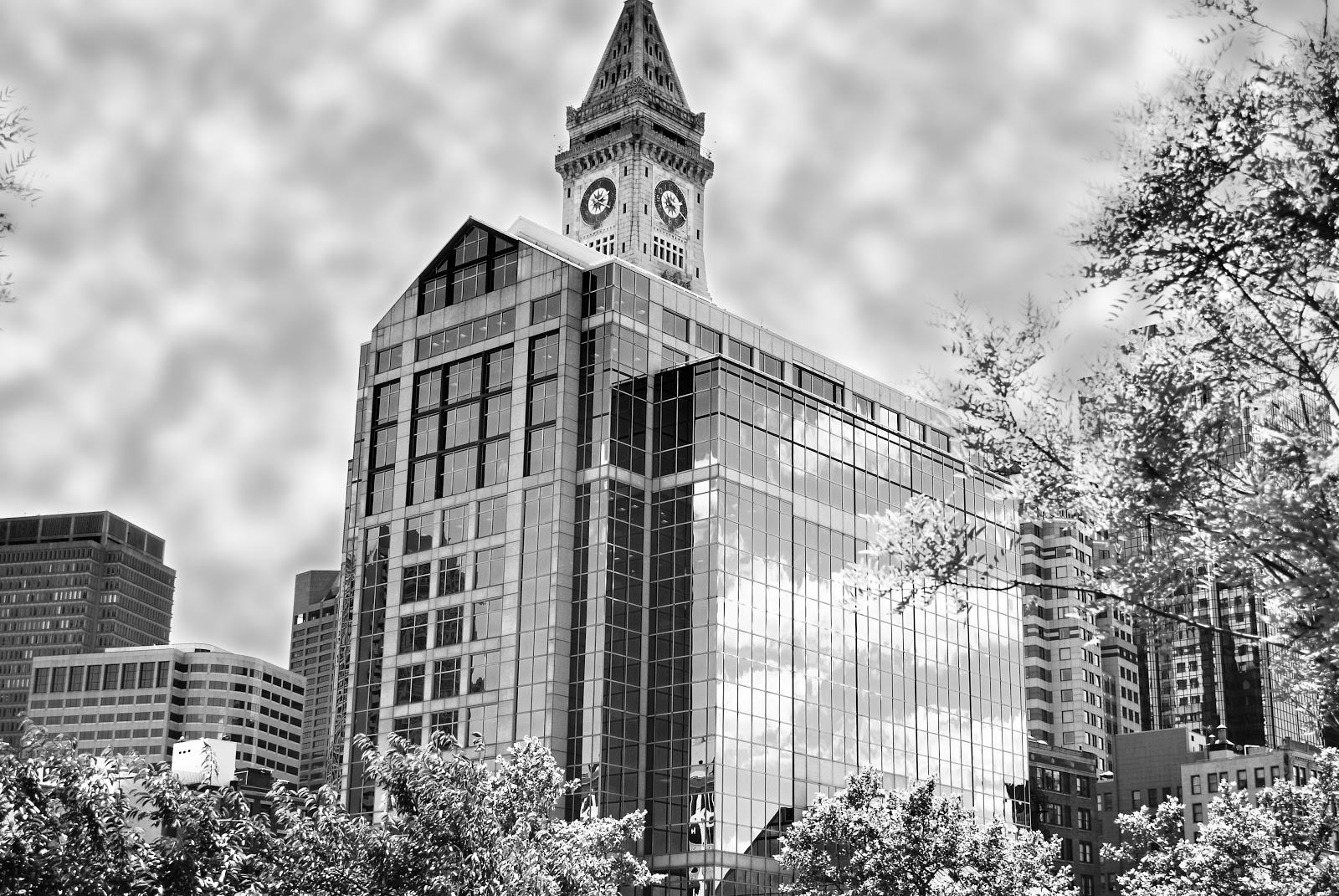
This was an experiment in infrared photography, using a 760nm IR filter and converted it to black and white. Green vegetation always looks white and sometimes slightly fuzzy (typically due to movement because of long exposure times) and the blue sky will always have a very dark and gloomy look. This was taken after noon on a sunny day with my aperture set to f8 and shutter speed at 20 seconds with my ISO set to 200.


....And More

I didn't want to add too many photos at once so I decided to split them up into a few posts so they wouldn't be too cluttered.

This was taken at Cordage Park in Plymouth, MA behind an abandoned old building that was falling apart. It's an old gas line cutoff valve of some kind. I used the Camera Raw filter (originally shot in RAW format) and added some texture and sharpness for detail and slightly adjusted the color contrast in order to see the differences between the dead grass and the valve.

This is a light post located on Cole's Hill across from the Plimoth Rock. I adjusted the vibrance and saturation to accentuate the rustic look of this great light fixture!

Same hill as the light post, but a few yards south. I used an action file in PhotoShop to get this effect and I added just a bit of detail to accentuate the shiny metal casing.

This is an abandoned smoke stack behind Cordage Park in Plymouth, MA. All the red and white specks on the ground are the remains of a demolished building that once was there. I only slightly edited this because I actually framed it exactly how I wanted it and all I did to in in post-processing was to slightly saturate the colors and adjusted the contrast just a bit. The sky was perfect and I use a UV filter on my lens, which helps get that dark blue hue.
 ....more to come....

It's Been A While....

I haven't posted in a while due to some personal changes I have been going through lately, but here is some of my most recent work. I've been trying new things and getting new equipment to experiment with. I hope you enjoy!

This was taken in a marshy area near the Marshfield/Duxbury beaches in Massachusetts. I used 10 images, taken at different exposure levels, combined to create a genuine HDR image. Then I tweaked some of the settings to get the look and feel that I wanted, which typically for me is LOTS of TEXTURE!

This next image was taken in Plymouth with the "Plimoth Rock" behind me. I was looking up at the sky and was instantly inspired to create an inverted image, but then I changed my mind after I saw the result of my original shot. Instead, I decided to adjust the colors a bit until I got a sort of surreal looking color effect.

This photo was taken at the Plymouth waterfront and i took several photos just of the birds flying around trying to get one "just right" of one of them taking off. It was cold and windy and highly uncomfortable but I finally got a decent shot. This photo was cropped down from the original and the colors and tones edited to my liking. I also used the Camera Raw filter in PhotoShop to add some texture and sharpness.
More to come, stay tuned!

Saturday, February 1, 2014

Droste Self

I found a website that allows you to make a Droste style photo using their online editing method. Everything is done and contained within the webpage it is located on which is: http://www.photospiralysis.com/WebAppGamma/RunApp.html and it works pretty well. I was happy with the result, but not happy about the method and the lack of options. I prefer that Adobe Pixel Bender would work properly and allow me to use the effects that I've downloaded through Adobe to get my desired results. Sometimes simplicity is not fit for what I'm trying to do, but nonetheless, here is my result.


Thursday, January 23, 2014

Taking Out The Laundry

I decided to do some experimentation with these photos I took of myself. I intended on doing this but I wasn't sure how they were going to fit together in order to get the result I wanted. I made an attempt and this is what I got. I consider it phase 1 because there's a lot more I could do to it, but I like to do things kind of "quick and dirty" at first just to get the idea from my head onto the screen. I know if you look closely you can see exactly what I did, but as I said its a quick and dirty edit for now. So here it is:


The Path

This is another older photo I worked on today. Cropped it down, added a little HDR toning, amped the color saturation up a bit for depth, and this was the end result. I'm learning that properly cropping a photo helps A LOT in creating a very pleasing image. I always hated cropping because my thought was, "If I took the photo that way, then that's the way I wanted it.", but by cropping out some unneeded details and even some out of place objects, you end up with a completely different composition. It's kind of like taking a story and rewriting a poem from it. It's still telling the same tale, just in a different way. i was actually quite amazed at what a difference it made to crop it the way I did. Just for fun I will add the original photo under the edited one. Another thing I'd like to point out is that my edited image began as a RAW image and the image below my edit is the "JPEG" version of the original.


Icy River

This is an older photo that I decided to edit slightly to give it more life. I spiced it up a bit and made it a bit more interesting to look at. Brightened the colors and added some saturation and contrast. I'm much happier with this version of it. I also fiddled with the hue and color adjustment to make it more realistic and true to the original scene.


Randy In Red Bull

This is a little something I felt inspired to work on late last night. Kinda started as a joke and then blossomed into a few hours of setting up and snapping away and then I spent far too long editing. Make sure you click on the image to see it full-sized. For some reason it got scrunched into the page.


Monday, January 20, 2014

My Moon, Sweet Moon

Do you have any idea how difficult it is to shoot photos of the stars and the moon? Extremely difficult without the right knowledge and equipment. It's so difficult because the light reflecting off the moon is so bright that it's difficult to see it well enough to focus on it. Auto-focus very rarely works and on all the websites I've researched about star shooting and moon shooting say that you should start at "infinity" with your focus ring and keep shooting at different focal lengths until you get desired results. That would take forever! Not only that, but trying to fine-tune your focus by taking shot after shot is just insane! For this photo I used my Quantaray 70-300mm telephoto/macro lens, on a tripod and flat ground in the pitch blackness of my backyard. It took a lot of time and a lot of Redbull to get it right, but I finally got one shot out of it that was decent. The blurry-ness of the image is due to the crappy quality of the lens. If the glass on your lens is junk, you will get junk photos especially when you are zooming in to the subject. The junky glass creates a messy warping effect because of the imperfections of the glass. You can have the best, highest megapixel camera in the world, but if your lens is crap then your images won't be as clear as you think. Evidence:


It's still a pretty awesome photo but I had to crop the hell out of it to make it the size it is.

Castle de Paris

This edit had me cracking up for so long I forgot to post it! If you look closely I think you may find something a bit familiar or maybe peculiar about this photo..... do you see my reflection in the tiles? It wasn't my original intention to put my face on the building, but I ended up doing it just for fun. The original idea was just to crop out everything but the tiles and a small portion of the sky and then adjust the exposure and brightness/contrast controls to make the building stand out more and give it a real metallic feel. Then I suddenly felt compelled to put my face on every tile and I couldn't stop myself!

I STILL CAN'T STOP LAUGHING!!!

B&W City of Boston With Added Clouds

This photo is an old photo I took in Boston, along with the other Boston photos I've posted here before. I didn't like the original, so I used an action file created by "Forf" called Forf's HDR Tools: HDR Fix Heavy. The action file automatically edited the photo to create an HDR style image. It turned out just how I wanted it. There are strong textured lines and contrast between the glass windows and the surfaces of the buildings. I love high contrast images. It gives depth to the photo and make it feel more life-like. I also added in the clouds because the original photo had an almost pure white sky and it drowned out the rest of the photo. I had to soften it up a bit by rendering the clouds using the RENDER filter and selecting CLOUDS. Then I masked out the buildings so the clouds only appeared in the sky, and I used the Gaussian blur to soften the clouds and round out the edges of the masked area. I was quite pleased with the end result.


Experimenting With Orb Shadows

I took a sample photo in the default Windows 7 pictures folder and decided to use it to experiment with making orbs/spheres and their shadows. I spent a considerable amount of time on it purely because my computer was being slow. I was trying to figure it out on my own and attempted to be clever and considered all options and all factors about the photo such as location of the lighting and the terrain and how it affects the shadow. After a long few hours of tinkering around with everything, this was my "final" product. i know I could have done better if I spent more time on it but quite honestly I was just too annoyed to continue.

 It's meant to look like a glass orb is floating above left of the rock formation and reflecting the terrain below it and around it in a mirrored image upside down. The fact that it is meant to be a glass-like orb, the shadow would presumably be slightly transparent. I made my best attempt at making it as life-like and as real-looking as possible. I plan on practicing more until I get it right.

Sunday, January 19, 2014

Higgins Armory Museum in Worcester

This photo (collage) was a compilation of photos taken of the Higgins Armory Museum in Worcester, MA. I used an add-on in Photoshop CS6 called TYCH PANEL and it allows you to take a number of photos and make a panel style collage from them. I added a lot of saturation to it to accentuate the gorgeous antique colors of the outside of the building. I also added the blue sky as an afterthought because the original sky was pure white and the windows were reflecting blue to I copied and pasted the sky after the panels were put together. I also did the color editing after using the vibrance controls in Photoshop CC.


THE RED DOOR

The mystery of the red door..... just kidding, this is one of my old Boston photos that I took and messed around with. I added color to the door because the original was B&W, and I cropped just a bit out of it so there wasn't so much outside detail. The first photo is just the added color to the door, and the second photo I did some liquifying to using the liquify filter in Photoshop CC.

w/o liquify
 with liquify
 An added note: It took me a LONG time to select the areas I DIDN'T want to color, but I realized it's ok to be a bit sloppy when selecting because if anything gets colored that you DON'T want colored, just use the erase tool to remove the color. The only bad part is that if you want to ADD more color to it, you have to repeat the process of selecting areas to color and add that to the mask. If you want to get really specific about your selections, take your time and make sure you are using a pen and not a mouse. All my work is done with a mouse because I can't afford a pen. A mouse isn't accurate or stable enough to use for intricate work, even if you zoom in really tight, the mouse still has a habit of jumping around.

Covered Bridge

There are LOTS of covered bridges in this part of the country and A LOT of them are out near me! I love old wooden covered bridges. They have history and they have character, and most of all, they are made of wood and I love things that are made of wood!
This photo I cropped a bit to remove excess junk from the frame and I brightened up the inside of the bridge to reveal some of the "artwork" on the inside. I also used a "texture" layered over it to add a little bit of "film" look to it and I turned the opacity way down and used the hard light blending mode to give it some personality. Normally I would have added a ton of saturation to this, but i didn't think pinup style for a covered bridge was going to look all that great so I gave it an old style feel instead.


Barn On The Farm

This is an old photo from just a few years ago when I first moved out to western mass. I love old buildings and farms and the feeling of going back in time when I travel to the outskirts of towns like these. This photo was cropped a bit to give more attention to the building, and the original sky was pure white and drowned out the rest of the photo. I layered another photo behind it that had a nice blue sky with wispy clouds and a nice blue hue. Once I got the sky blended just right I looked at the photo and felt like it just didn't look right. Then I thought about making it B&W, but I make that mistake too often so I decided to give it a Sepia tone filter instead. This had a nice old fashioned feel to it and made it feel nice and warm. The blurred fence post i decided to keep just for the visual feel of motion, but I did actually take this photo while driving (do not do that, it's dangerous)! One of my first steps with this photo was to try to reduce the blur, so I used my "Shake Reduction" in the blur filters in PhotoshopCC. It helped reduce the blur on the building. A little.


EXPERIMENTING WITH ADDING COLOR TO B&W

I LOVE black and white photography. The problem is, when you shoot B&W from the camera, there's no way to get the color back. When you shoot in color from the camera, you can always convert to gray-scale or B&W and still keep a copy of the original color photo. Here I am going to show you two photos that I shot in B&W from the camera, but then added color to it. These are just quickies, so please forgive me for the little things you can see. This is a really neat technique to use when you have old B&W film or B&W photos scanned to your computer and you want to add color to them. The results can sometimes be amazing!

I made her hair look more like her actual hair color, added pink to her lips for effect, and made her eyes blue. I could've gone and done her face but I liked the way her eyes and lips popped. Maybe I will do her face next time.

carnation
This was my first attempt with this technique so just ignore the rough edges for now. Typically in my older works I had taken a color photo and created a B&W layer of it and then erased the flower so the color layer would be revealed. This was fun because I got to add whatever color I wanted to the flower! There are many ways to get color added to a photo. The technique I used in these were the simplest of the ways I've found. I created a mask using the paint brush, then created a color adjustment layer from the mask and used the sliders to choose the colors I wanted. It was quick and simple and produced a near life-like image.

New post of an Old photo

I decided to look back on some of my older work from when I was a photography student. I took a number of photos in Boston for a project for class. As I skimmed through these photos I liked the content but didn't like the way the photos seemed to sit lifelessly on my screen. I decided to use layers to make it come to life. I copied the original photo to several layers and each layer I used in a different blending mode with differing opacity to bring out the details a bit and make the photo a bit "stronger". I like the final product. What do you think?

BEFORE

 AFTER


 It may only seem like a subtle difference, but to me it was just enough to give the details some courage and give the photo enough realistic contrast to not look so lifeless.

Wednesday, January 8, 2014

Dog Portrait

Yes, a portrait of a dog! It may seem cheesy but I think I captured this perfectly. I got down on the floor and set my camera down in front of him and snapped the shot. The lighting was perfect and the face was perfect and I think I only had to make a slight adjustment to the brightness and contrast to bring out a bit more detail.


Jacksonville Beach

This photo was taken at a beach in Jacksonville, Florida. I edited it using Adobe Photoshop CS6 and I used an HDR filter and a blurred vignette to bring focus to the water. My main intention was to focus on the reflection in the water and accentuate the details if everything within the water element.


Jacksonville Florida Skyline At Night

I took this when I lived in Florida. I was living only about 30 minutes from Jacksonville so I often drove up their with my friends and spent hours roaming around the city and taking photos of everything!


Saturday, January 4, 2014

THE STAIRS

This is a photo of the spiral staircase in the building on the top of a very famous mountain in Deerfield, MA. Again, as always, I used the HDR Toning filter in Photoshop CS6 to get the resulting look. I liked the metallic look of the steps and I added a bit of saturation to accentuate the rust patches on the steps. The steps were in fact made of steel, but the original colors were not as appealing.


TEST

testing out some features of this blog site. bear with me as I try new things.

http://tasktojob.com/index.php?task=7313

DRAMATIC CAPE COD

Three more photos from my trip to the cape seen here. A gave these photos different treatment to show a more dramatic mood instead of my typical HDR Toning filter that I use for almost everything. The first photo I used something called an "action" in Photoshop. An "action" is basically a copy of someone's actions when they edit a photo. The person creating an action can record each click and each step they take during the editing procedure and bundle it into a file called an action. This gives the user a way of repeating the same procedure over and over with similar results. It's a way of automating the editing process so a photographer can take a series of photos within a set and make them all look similar if they so desire. Action files can be searched in google and most of them are free. Some artists create actions and charge a small fee for using them, and most artists actually ask you to give them credit for their actions being used in your photos. I don't remember the authors of the actions I used for these photos, but I saved the photos with the name of the action used for each of them.

pinhole

 haunted

adrenaline

BEACH ON THE CAPE

Here are two more photos from my visit to Cape Cod. I took these on the beach and used the same HDR Toning filter and had some very high saturation added to it the way I like. These images are among my favorites because they came out just how I wanted. They look almost as though they are painted! Again, if you look at the blues in the sky you can see all the speckles of noise. That is a direct result of using the filter, but the result was amazing in my opinion.


CAPE COD IN THE WINTER

Here are a few edits I did of some photos I took while I was visiting Cape Cod during the winter. I used the HDR Toning filter in Photoshop CS6 to get them to look the way they do. I like how they turned out because I like some photos to be highly saturated with a lot of contrast and bright colors. The only problem with using the HDR Toning filter is that it ends up making most of my blue colors look very pixelated and boxy looking or noise-infested.


Thursday, January 2, 2014

THREE OF ME FLOATING

This was done at my house. It's an example of the copy and paste method of editing a photo to create a false image. The previous image had 3 separate photos combined into one image, but this one is technically 2 photos. The first photo was taken of me standing on a bucket. The second photo was taken of just the background. Use a tripod, don't move the camera, and voila! The use a photo editing program such as Photoshop CC and when you combine the two photos, each as it's own layer, you can erase the bucket from the second photo and it looks like I'm floating in mid-air. Then I selected myself using the quick selection tool and copied myself twice and placed myself on either side of the first "me". I could've done a lot more with it but I left it as-is so I could post it. I also couldn't do any further editing because the original photos were not taken with my camera and I didn't save them to my computer, I only saved the edit.


3 OF ME

I was bored one day and decided to try to create something interesting on my own. I set up my tripod and I took 3 photos of myself at different positions and I put them together. I used masks and layers and a whole lot of adjustments to make it all look like it really happened. this was actually my second version of the photo.  It took just a few hours of tweaking to get it the way I liked, and really I'm still not 100% happy with it but I wanted to share it anyway as another example of the wonders of photography!


Wednesday, January 1, 2014

When I Was In The Army

I decided I wanted to share these photos of me and some of my experiences in the Army. I was stationed in S. Korea and it was between 1998-1999. Quite an experience to have.